January 26, 2020

A small goodbye, and a big hello

For the last 16+ years, we have happily given thousands of creatives a free place to launch their online portfolio. (yes this is how old we are already)

While we wish it could stay free forever, that wouldn't allow us to keep making our platform even better for you. And as an independent and small company, we want to keep building the best portfolio builder there is 💜 Which means starting on August 1, 2021, we are sadly discontinuing the free version of Carbonmade (this also includes the OLD Carbonmade system as we move everything to our brand new platform).

What does that mean for your portfolio?

We hope that you enjoyed our free service for the past 16 years. If you're up for it, we'd love to welcome you on our brand new Carbonmade v4 platform.

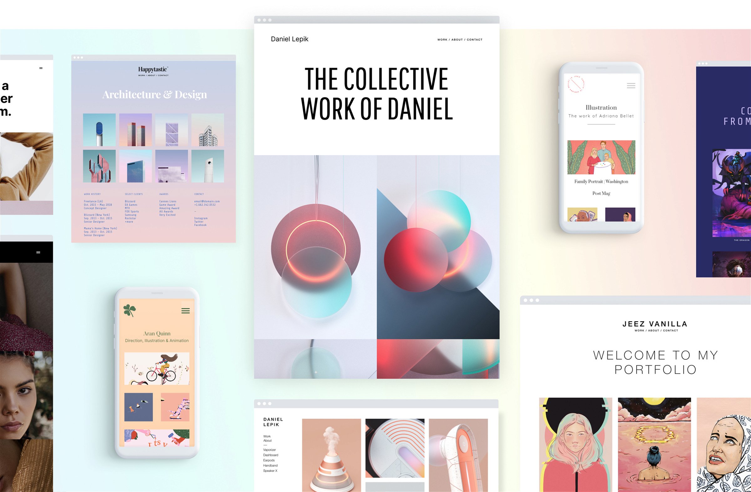
Carbonmade has grown up a LOT since you last used it. (Just look here! We swear, it's completely different to your current version of Carbonmade.) And with literally a couple clicks, you can move your current portfolio to the new, paid version of Carbonmade. All your work will transfer over. Plus, you’ll have access to our new builder and tons of extra features to make your site even better.

So, what happens next?

No rush, you have time to try out the new Carbonmade and decide if you want to upgrade and stay with us. If you haven’t decided by February 15th 2022, your free portfolio will be taken offline. But don’t worry – we’ll keep it safe (and send you reminders) for a little while before deleting it permanently. Just in case you change your mind.

P.S. If you decide not to upgrade, you can export your current site to save all your content before it's deleted. Send us an email to help@carbonmade.com and we will help you with the move.

Ready to see what you’ve been missing?

Go ahead and give the new Carbonmade a try. You can explore it completely for free before deciding if you want to migrate your site over. But I have a feeling you will like it 🙂

🎉 BONUS: We'd love to give you a month on the new Carbonmade PRO plan completely for free – just for you, for reading all the way to the end. It's a tiny thank you gift for your years of loyalty to Carbonmade, and a chance for you to try it without any commitments. Here is how it works:

  1. Make sure to migrate your portfolio from the old Carbonmade to the new Carbonmade right here (this is totally free).
  2. Once you've done that, send us a quick email to help@carbonmade.com and we will give you a free month on the new Carbonmade PRO plan, entirely on us so you can launch and GO LIVE right away.

Keep building,
Zoe & the Carbonmade team
January 14, 2020

The Carbonmade 4 reviews are rolling in

You like us, you really like us!

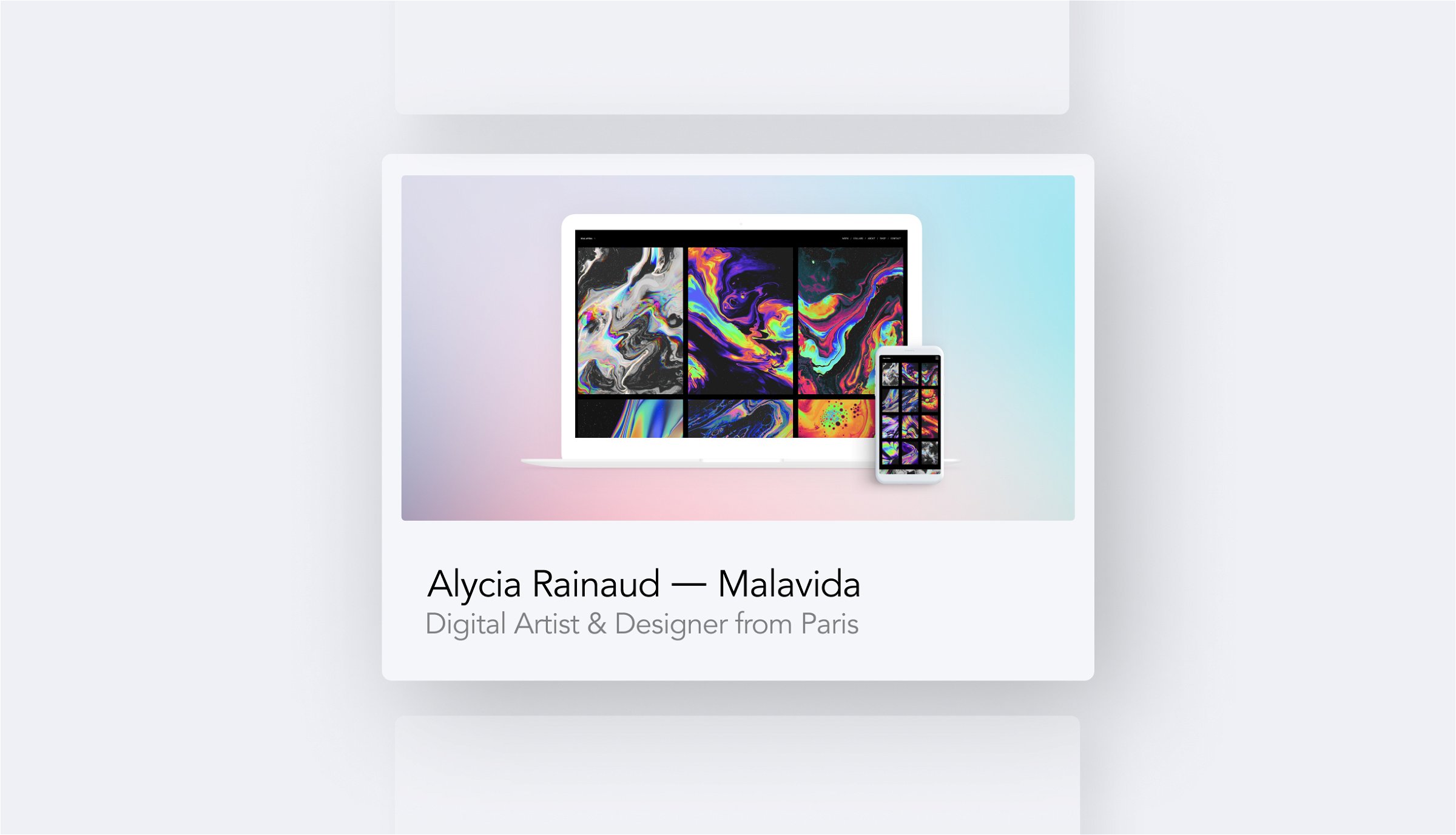
Thank you to Superb Website Builders and Hosting Review, who recently tested Carbonmade 4 and shared their honest takeaways. Read their reviews right here: 

Superb Website Builders

“The website builder is very easy to use. It offers a literally instant way to set and run an online portfolio with no coding skills.”

Hosting Review

“If you are looking to build a tidy, fun looking website in one sitting, then Carbonmade is just for you.”

November 8, 2019

Customize your share preview

Chances are, someone discovers your portfolio on social media, shared by either yourself, by a friend or secret admirer of yours.

And to make sure your portfolio looks extra fresh on social media, we now shipped a new feature where you can customize exactly how you want it to look on Facebook, Twitter or LinkedIn.

Upload a sweet little graphic, give your portfolio a catchy title and description and you're all set. Now, when someone copy/pastes your URL and shares it on social media, it will automatically show a beautiful preview.

Try it out yourself right here.

August 22, 2019

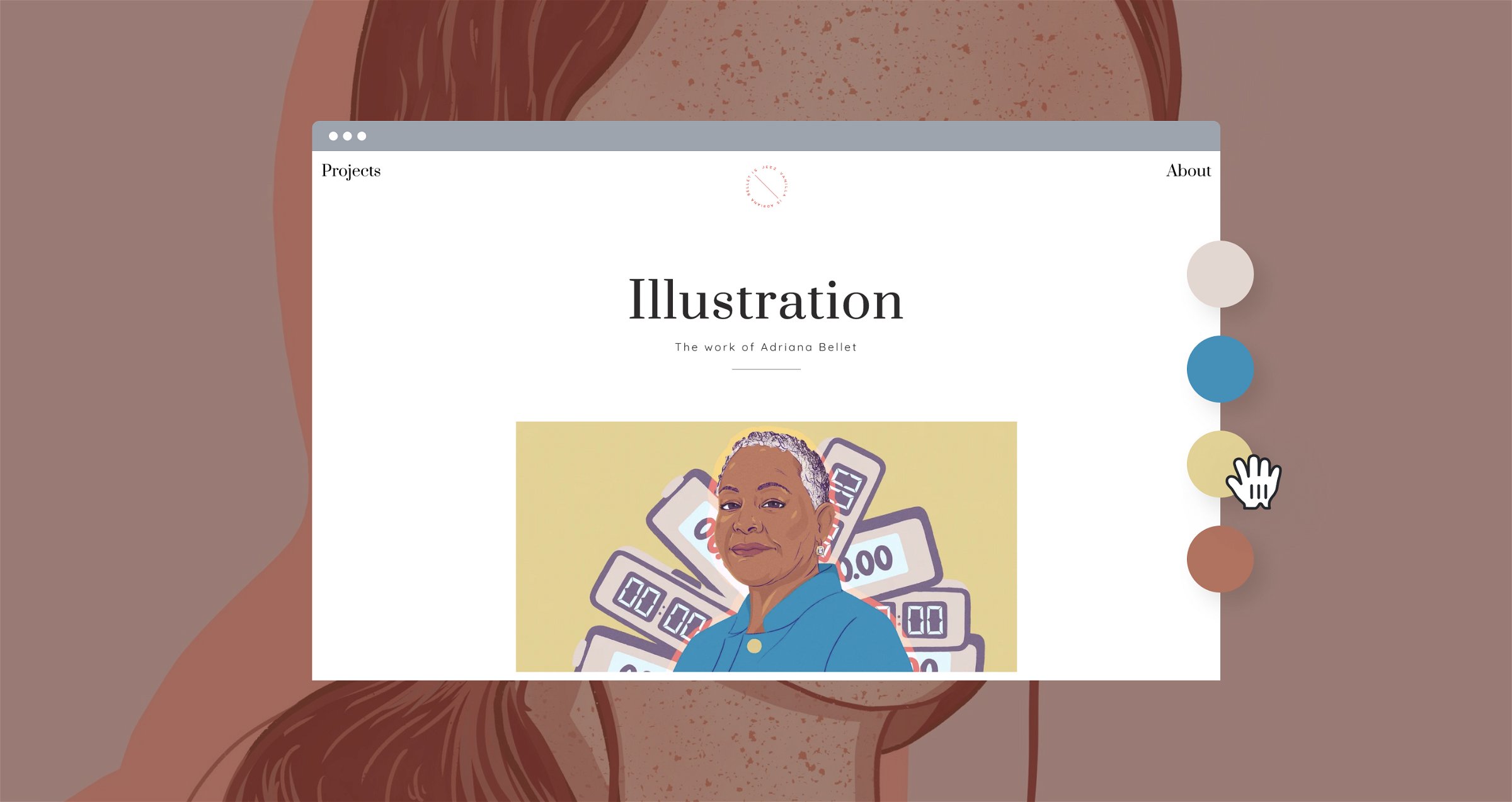
Customize all the things & why Carbonmade does not have themes.

Let's get straight to the point: We think themes or templates lock you in. You're a creative, you try so hard to make your work unique so why shouldn't your website be unique?

This is why we designed Carbonmade the way it is. We still give you a hand to make it easy for you, but it's all about mixing, matching and then customizing it the way YOU like it. Even if you don't care about making websites, I'm sure you care about your work being presented in the best light possible.

When signing up for Carbonmade, we still let you pick a starting point (kind of like a template), but then you can pretty much change the look of your entire site within just a few clicks.

To show you just how endless the possibilities are, we made a little video for you here:

Do you have any questions? Reach out to us via email or Twitter. We've built thousands of portfolios over the years, so you can really ask us anything!

Ready to get started yourself? Sign up to the new Carbonmade 4 right here.

July 1, 2019

5 Carbonmade Tips To Stand Out — How To Build Your Best Online Portfolio

We know how hard it is to launch your own portfolio. It's a mix of not having too much time and fighting against your own perfectionism. You're a creative after all, and that's a good thing (: So here are 5 tips on how to get the most out of your new Carbonmade portfolio.

1. Upload a custom logo

Uploading a custom logo is easy and you can use a GIF, PNG, JPG, or whatever you please. It's a small thing that makes your online portfolio more personal and stand out.

→ How to upload a custom logo

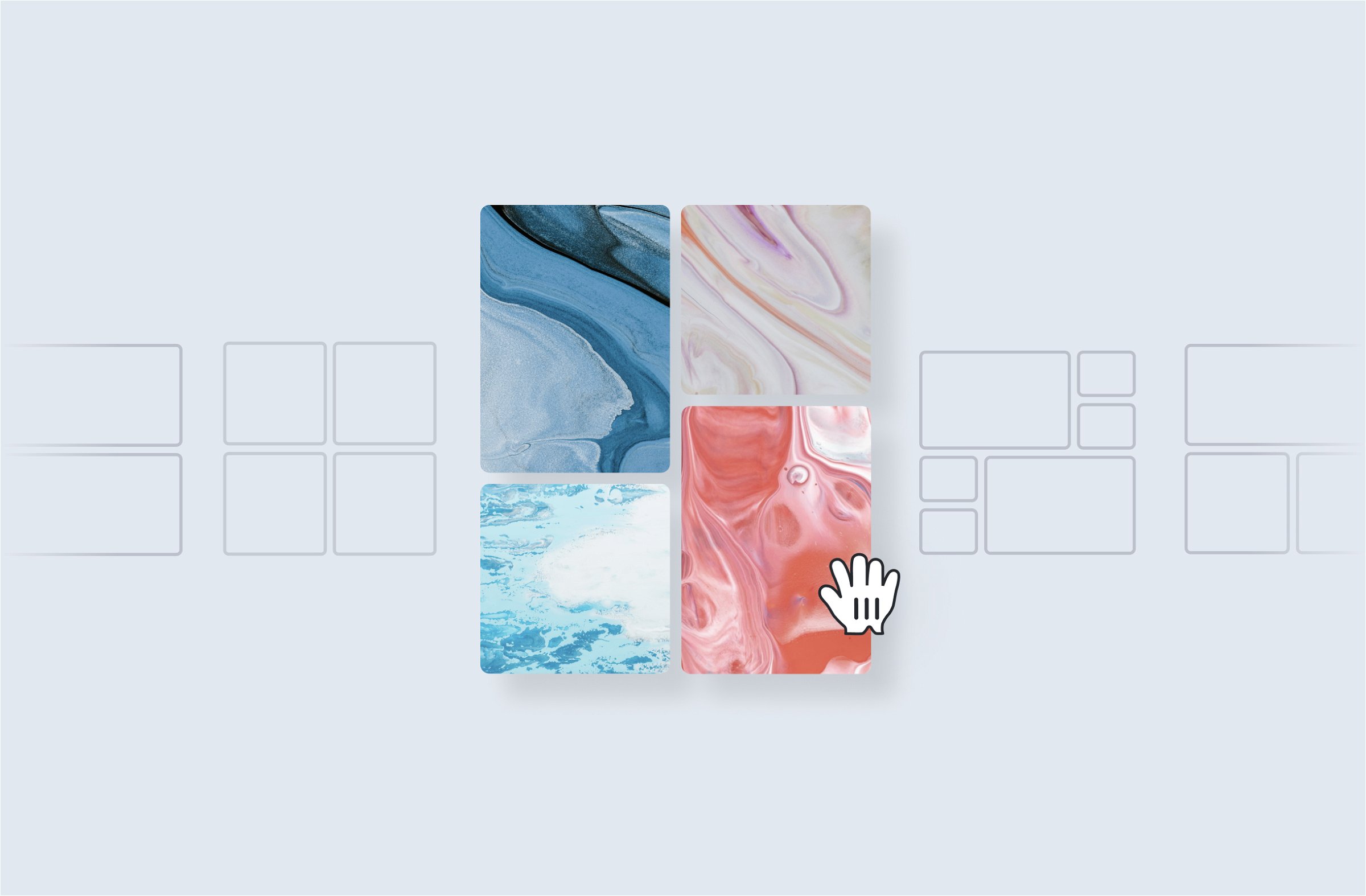
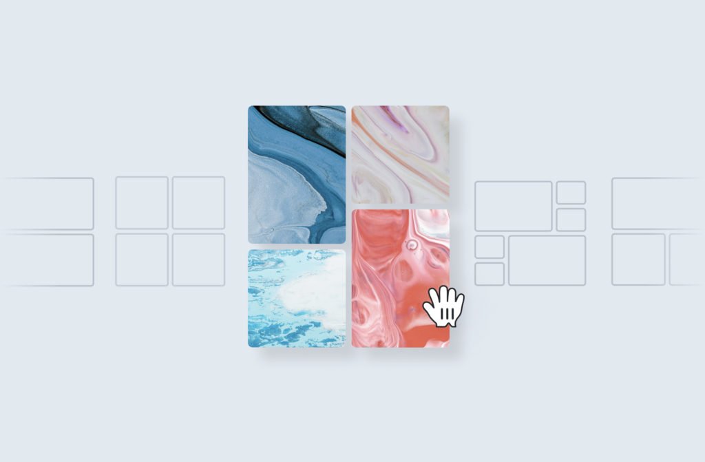
2. Change your portfolio grid

Try out some different portfolio grids. The easiest and fastest way to change the entire look of your portfolio is to change the portfolio grid. Perhaps your work suits better on a clean square grid? Or maybe some bigger featured images? It's just one click away.

PS: You do need to add some projects first of course to see it's effect.

→ How to change your portfolio layout

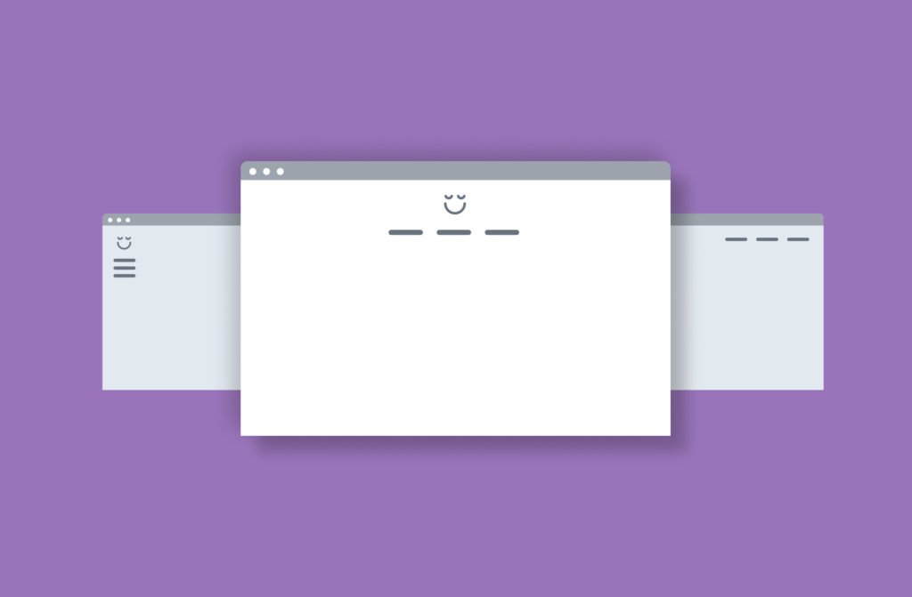
3. Change your navigation

Your navigation is a big part of the overall layout of your website. Luckily Carbon 4 makes it easy, you can change your entire navigation with the click of just a single button.

→ How to change your navigation

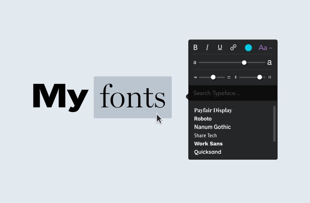
4. Try out some different fonts

Some say that getting the typography right is half of what design is all about, and we think that's very true especially when it comes to web design. If you see any text in Carbon, just mark it and play around with the size, spacing and fonts if you want. Super simple.

→ How to customize your fonts

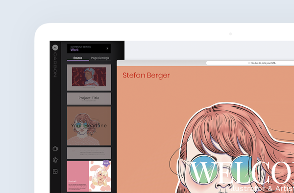
5. Use blocks to build your case studies and project pages

Blocks are the heart of the new Carbon of your case studies. Simply drag a block you like on the page, click the ⚙️ icon on the right side of the block and customize away! Try re-ordering blocks and build your project pages exactly the way you always wanted.

→ Re-order and customize your blocks

Whatever you do, I hope you have fun when creating your portfolio. After all, it's about your passion and showing off your beautiful work. If you ever need help, don't forget our entire team is here to help you.

Just visit help.carbonmade.com or write us a quick email if you couldn't find what you were looking for.

June 23, 2019

✨ New sub-domains!

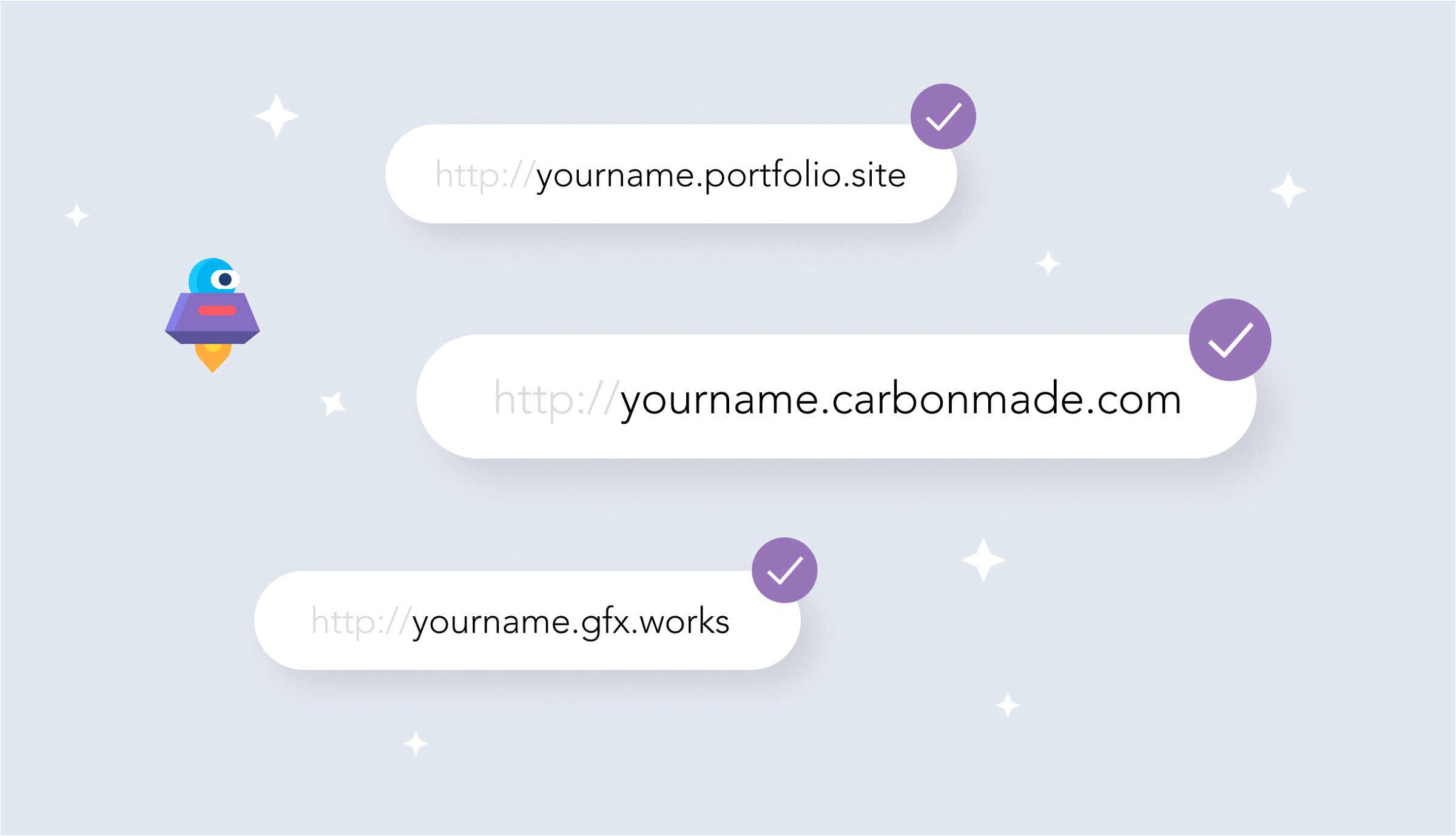
We know how hard it is when your name or domain is already taken. That's why we just added two more sub-domains you can choose from for your online portfolio.

Now you can choose from the following:

yourname.carbonmade.com
yourname.portfolio.site
yourname.gfx.work

Pretty cool right? Of course, if you want to go even more professional you can also connect your own .com or other domain. If you have more questions you can always send us a quick tweet @carbonmade or browse through our help forum.

May 23, 2019

New feature: Connect your custom domain

You heard right. You can now look all professional by connecting your custom domain to your Carbonmade online portfolio.

We've added a nice little help article right here for you that should answer most of your questions.

Simply put: Just click on the little ⚙️ icon in the bottom left corner and navigate to your account settings, then click on "Domain" and we take you from there.

Happy launching!
Your Carbonmade team

May 8, 2019

The new Carbonmade 4 is here, your new online portfolio.

We've been quiet the last year or two, and now you know why. The new Carbonmade 4 is finally here and we're very excited to show you what we've worked on for you.

Carbonmade has been around since 2005 now, can you imagine? That's a crazy long time, but we haven't changed a bit when it comes to what we care most about: Helping creatives show off their work. And with the new Carbonmade 4, we hope that this is now even easier and more fun than before.

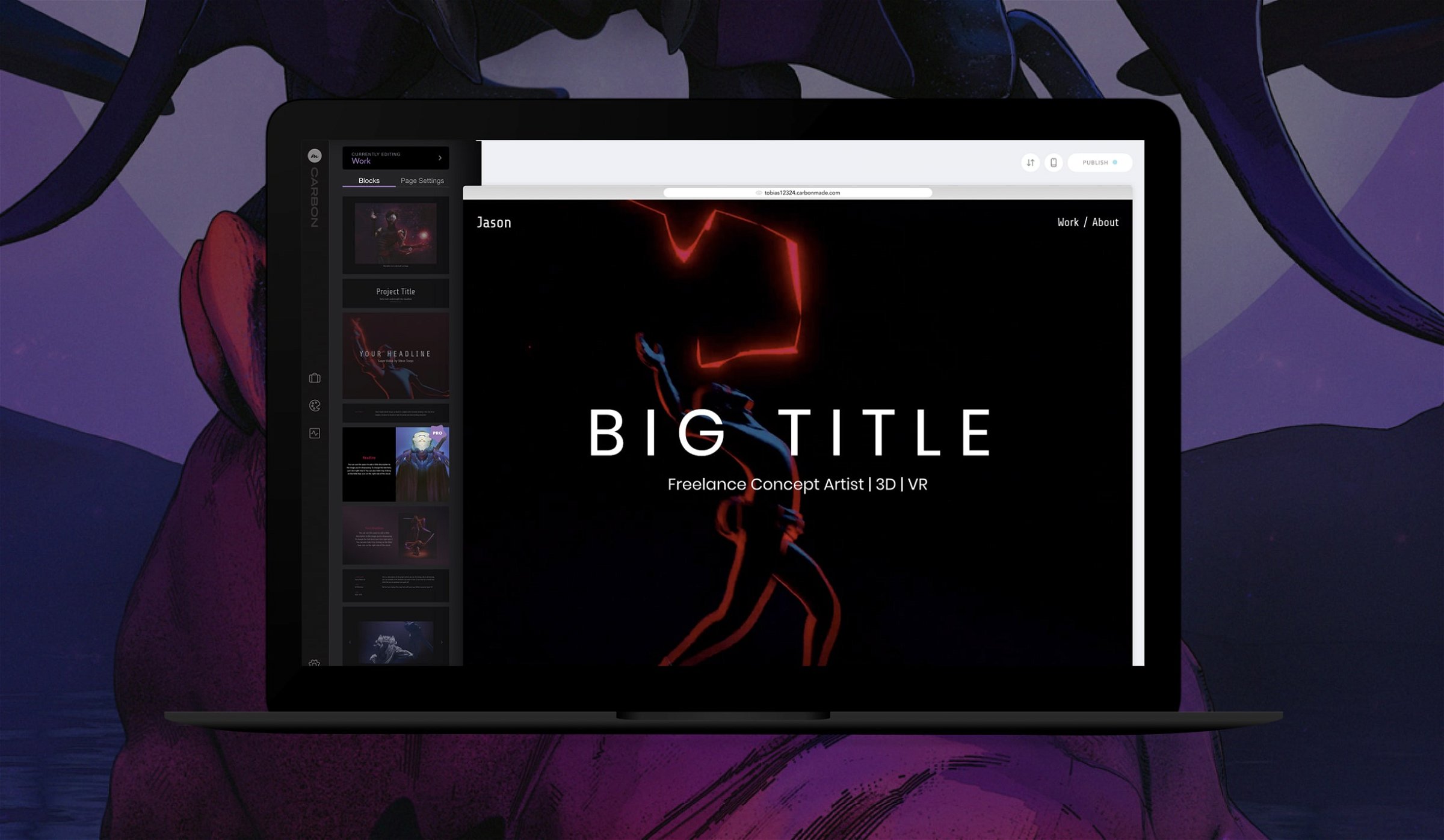
We've completely re-designed and re-developed everything from scratch. There are no more templates that lock you into one particular design. Everything about the new Carbon is about mixing and matching. You start off by picking a starting point (a layout we specifically designed for you) and then you just start customizing, changing colors, fonts, re-arranging or adding new blocks to your project pages.

Honestly, this blogpost would become way too long explaining what we did, but the best way is just to see yourself.

Sign up here and see for yourself. It only takes 30seconds and you're in.


More resources:

How to switch from the old to the new Carbonmade 4
→ Need help with Carbon? Visit our help center
→ Have questions? Write us an email