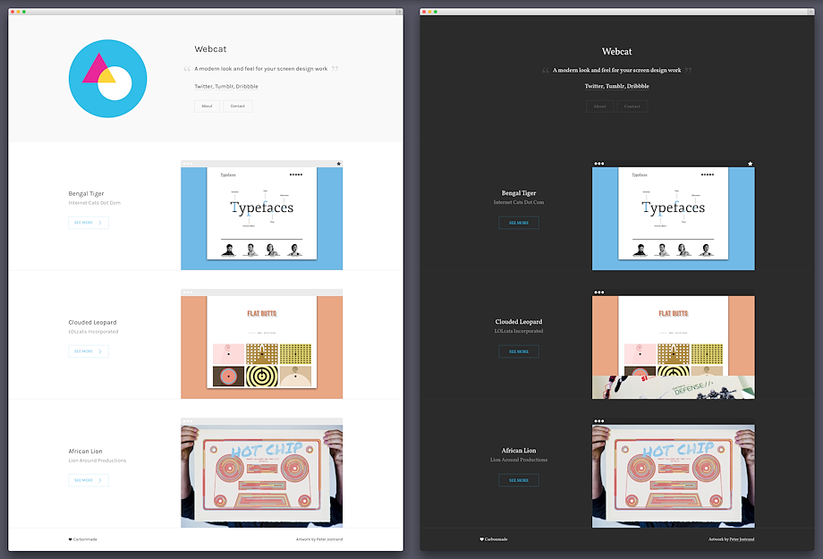
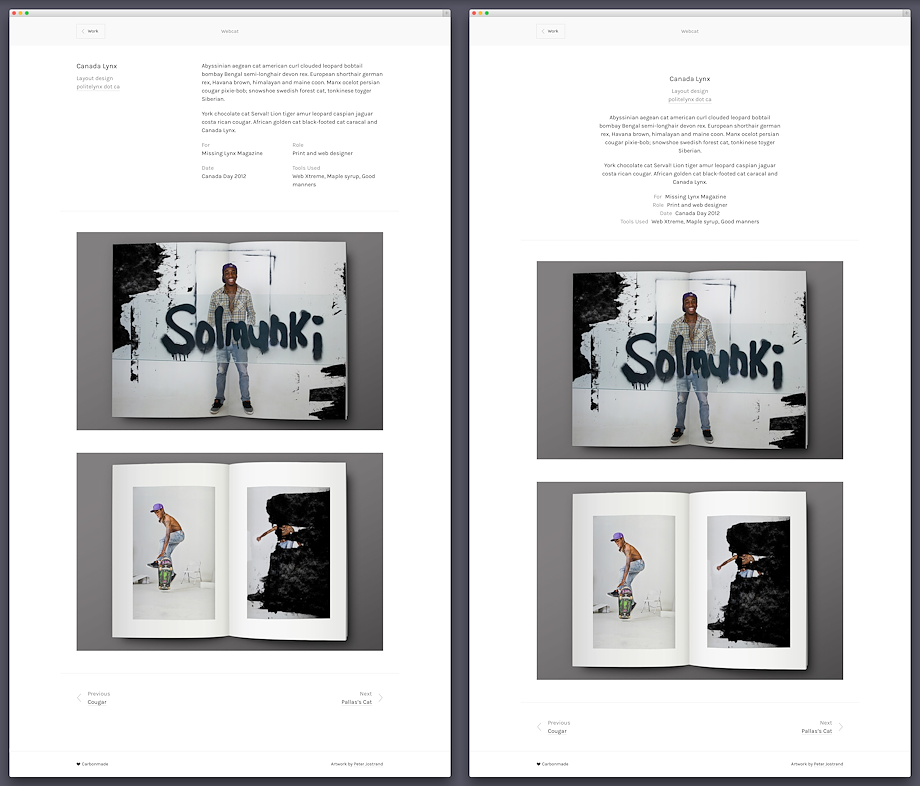
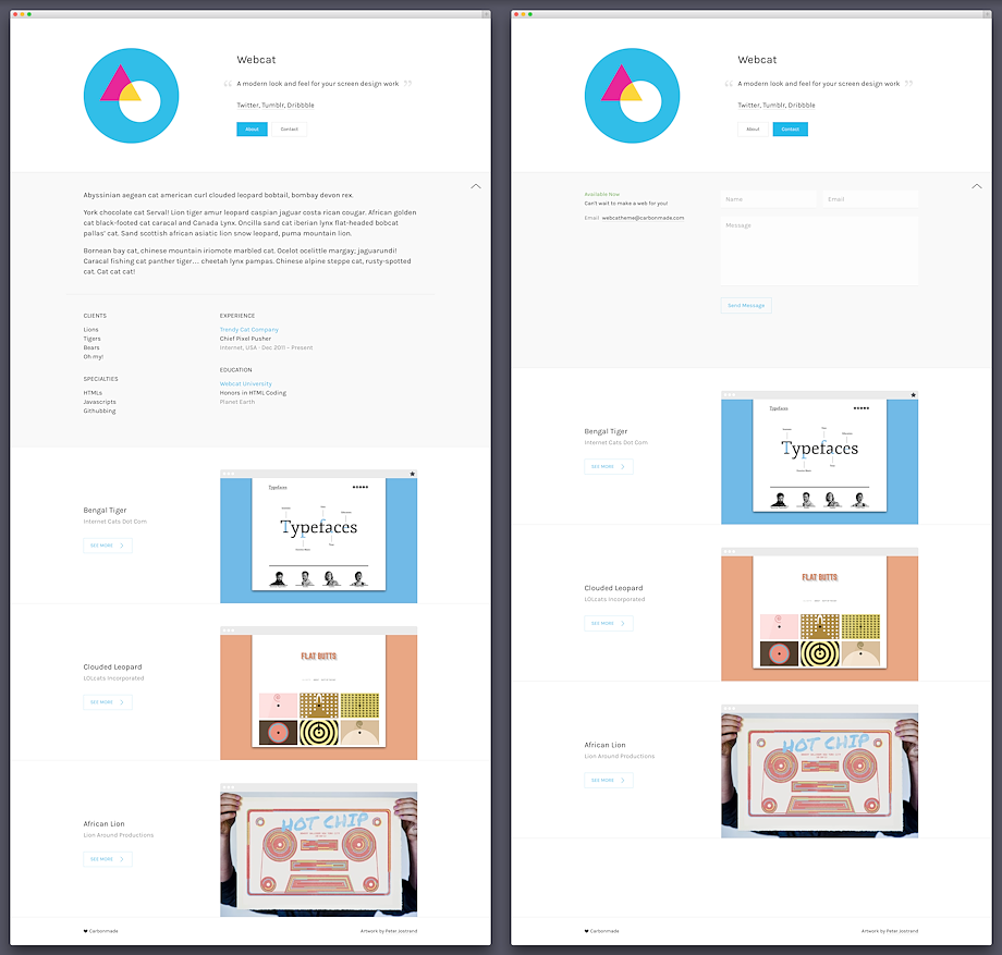
Webcat is pretty special. It was custom-made for web designers and pixel pushers of all stripes. It's basically a "one-pager" on steroids. Every project has a dedicated page, but the About and Contact sections are kept inline on the homepage.
Are you maintaining a strong personal brand? Is your avatar widely recognized? Are you a one-man-web-powerhouse? Then Webcat is probably for you. It's deceptively simple and yet very elegant.
Check out our sample theme to see it in use!
Homepage

Adjustment Options
- Black or white color scheme
- Two font options (serif and sans-serif)
- Three color moods ( green, blue and orange)
Thumbnail Sizes*
The thumbnail size for Webcat is 567 × 360 pixels.
* It never hurts to upload bigger images. We'll take care of the downscaling for you.
Work Section

Image Sizes*
The images on Webcat are displayed at 960 px width.* It never hurts to upload bigger images. We'll take care of the downscaling for you.
About + Contact Sections

Theme Options
Basics
- Portfolio title and footer blurb
Branding
- Custom logo
- Custom favicon
Theme Settings
- Black or white color scheme
- Three accent colors (green, red, blue)
- Serif or sans-serif font treatment
- Left- or center-justified text
Home Page Styling
- Pick your Subtitles (client, type or date)
- Show/hide Thumbnail frame (faux-chrome)
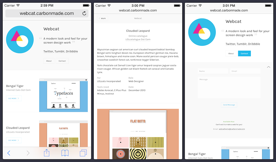
Mobile Version
For Webcat's mobile version, we went a more subtle route. Just putting big thumbnail after thumbnail would have completely robbed this theme of its character. Instead, we moved the type and thumbnail around a smidge to make it easier to navigate and read while still maintaining the theme's integrity.
