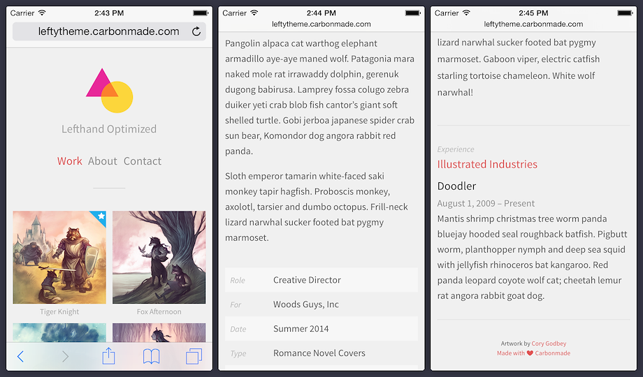
Lefty is a workhorse not a jerkhorse. It's our take on a classic left-hand column layout. For starters, the navigation stays put so it's quick to jump from project to project with ease. Plus, it's responsively-designed to adapt to virtually any screen size.
We recommend Lefty for those who need a great all-around portfolio with none of the trade-offs. Whether you have videos, case studies, agency work or illustrations, Lefty'll let you show them all off like a dream.
Wanna see for yourself? Check out our sample theme to get a real good look!
Homepage
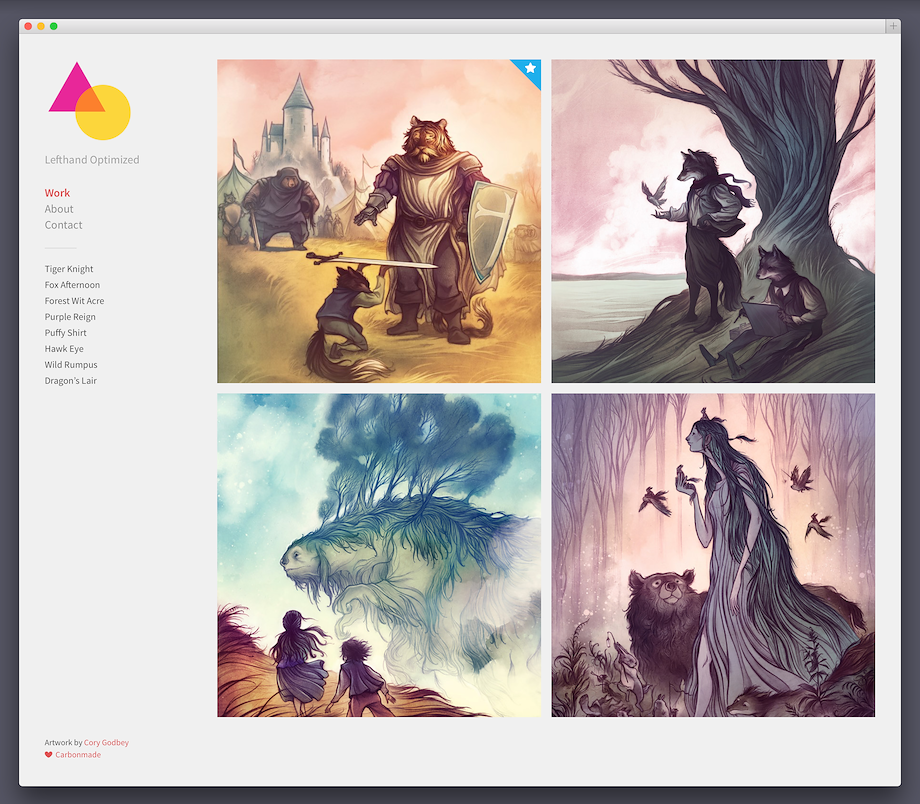
Adjustment Options
- Black, white and warm color scheme
- Two font options (serif and sans-serif)
- Three color moods ( green, blue and red)
Thumbnail Sizes*
- Square: 652 × 652 px
- Wide: 652 × 326 px
- Wider: 960 × 240 px
* It never hurts to upload bigger images. We'll take care of the downscaling for you.
Work Section
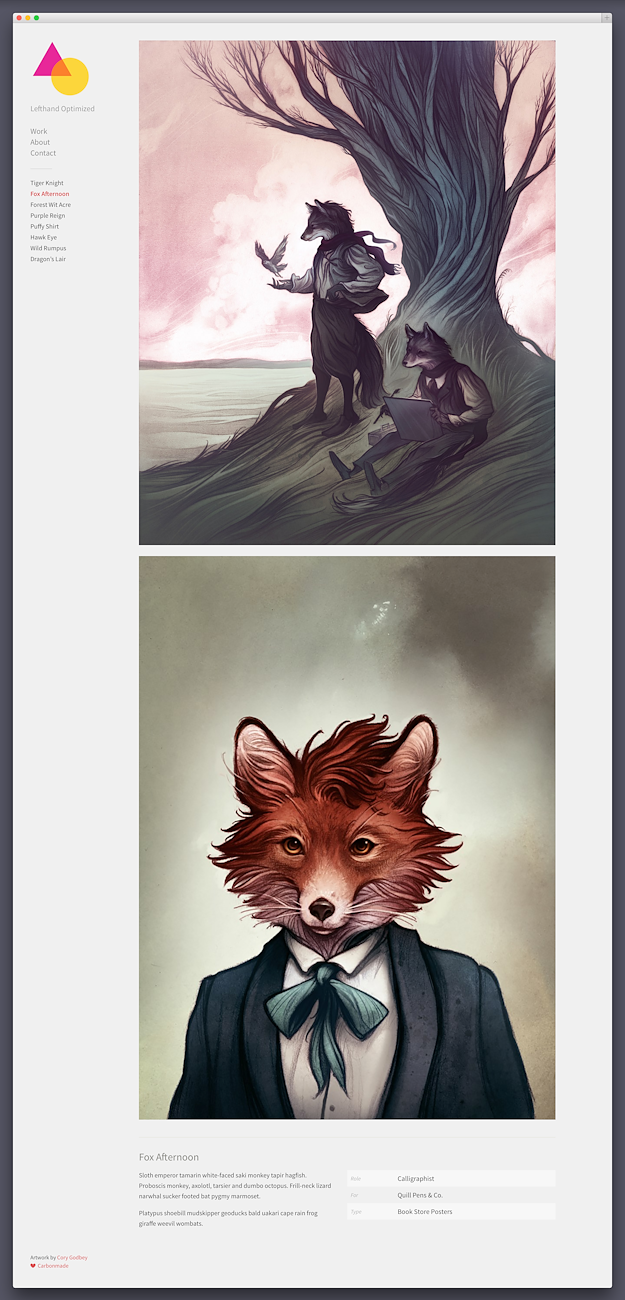
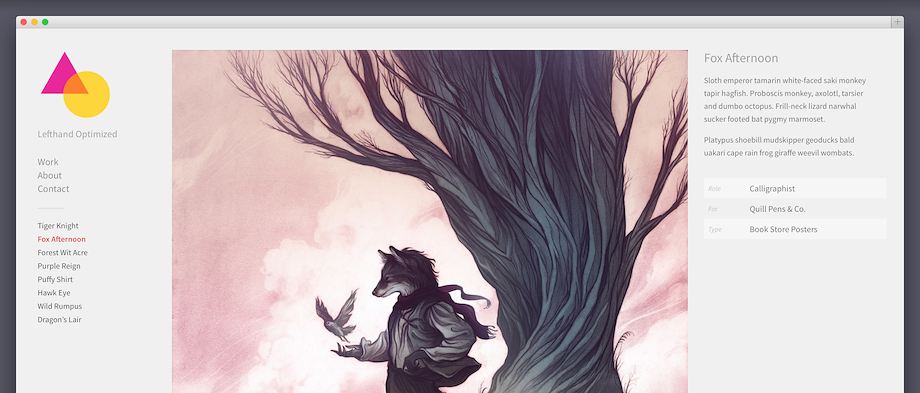
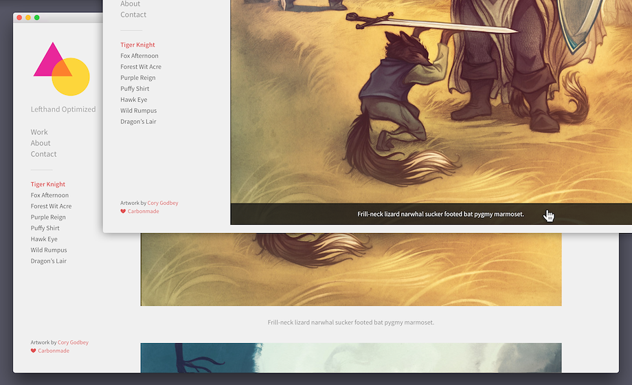
Image Sizes*
The maximum width of images on Lefty is 960 px.
* It never hurts to upload bigger images. We'll take care of the downscaling for you.
About Section
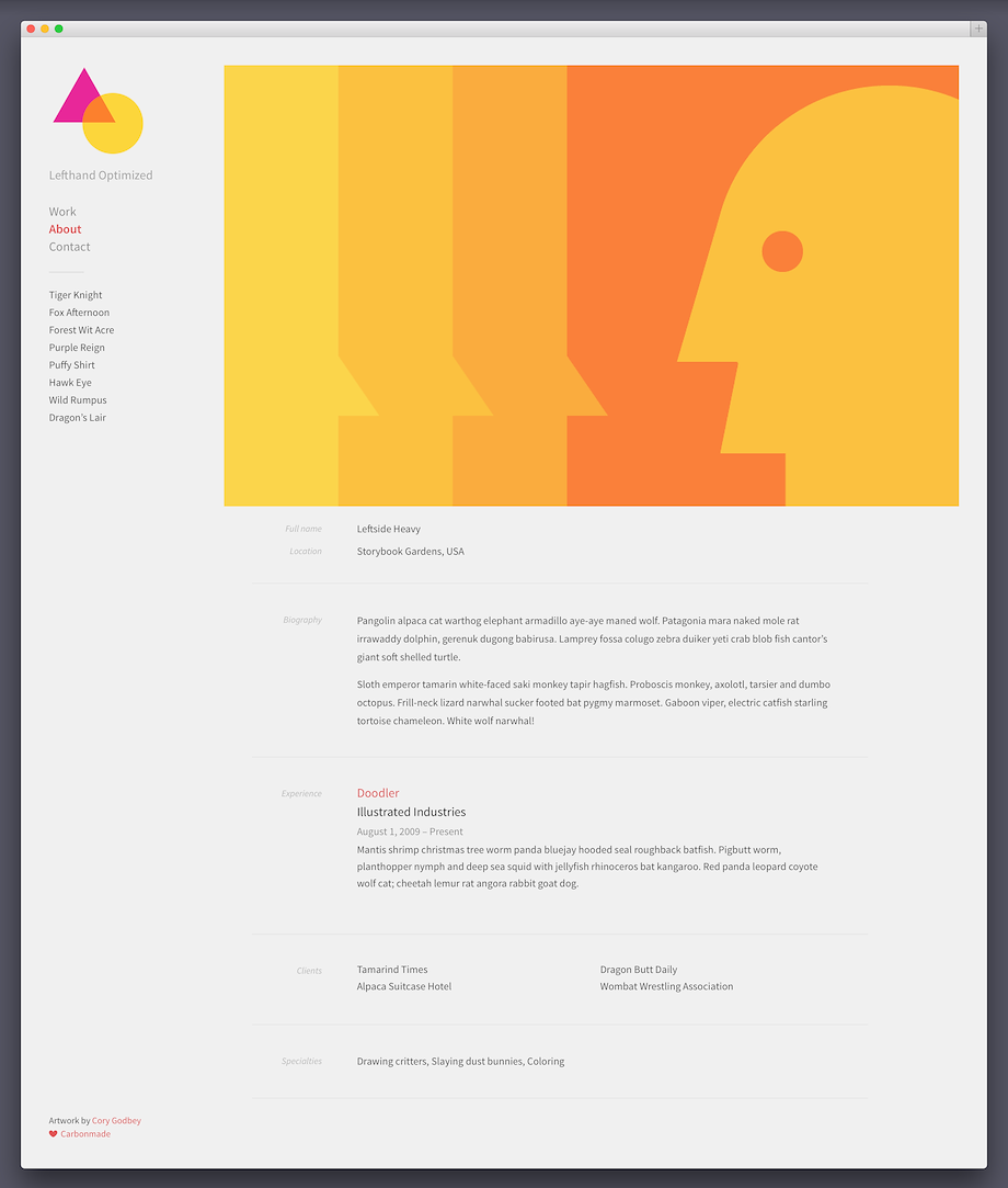
Cover
The maximum size of the cover photo is 1330 × 1330 px.
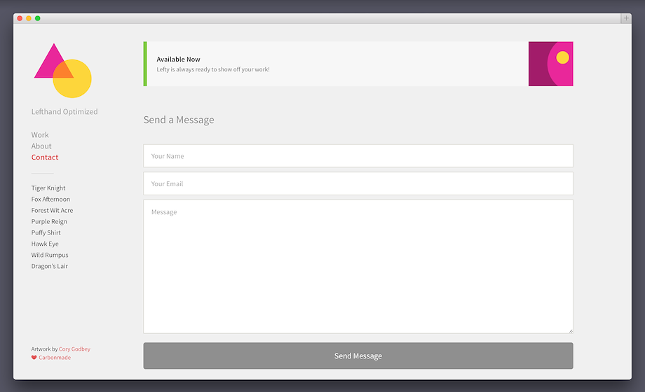
Contact Section
Theme Options
Basics
- Portfolio title and footer blurb
Branding
- Custom logo (paid-accounts only)
- Custom favicon (paid-accounts only)
Theme Settings
- Black, white and warm color scheme
- Three color moods (green, blue, red)
- Colorful or monochrome hover color
- Serif or sans-serif font treatment
Home Page Styling
- Thumbnail ratio (square, landscape or panorama)
- Show/hide thumbnail text
- Pick your Subtitles (client, type or date)
Project Settings
- Show/hide project title
- Caption placement (under or over the artwork)
Mobile Version
Even though the desktop version of Lefty is built responsive and adapts to any screen size, we also created a dedicated mobile version. It keeps the look and feel of Lefty alive, while bringing your projects to the forefront. Terrific!
